Upgrade from Drupal 7 to Backdrop CMS
Our Work
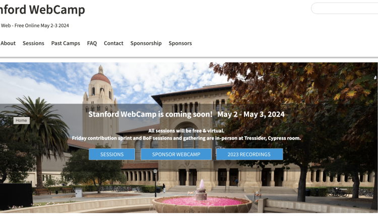
In 2022 new website was built with BackdropCMS and Stanford Decanter theme for yearly Stanford WebCamp
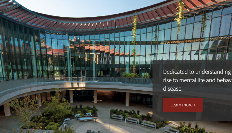
Content is king. When migrating to Drupal 9, Wu Tsai Neurosciences Institute undertook a full content discovery audit, resulting in a clean structure for their complex content in their new site.
Our goal was to integrate dispersed data into a single website which would allow data consistency and a helpful user experience... all on Backdrop CMS!
Taking VPGE from Drupal 7 to Drupal 9 involved collaboration and detailed content auditing to create new content types to display unique resources for grad students.
This redesign process built a more accessible website to help CPQCC members find the resources they needed, and highlight their important work and accomplishments... so that they can keep saving babies.
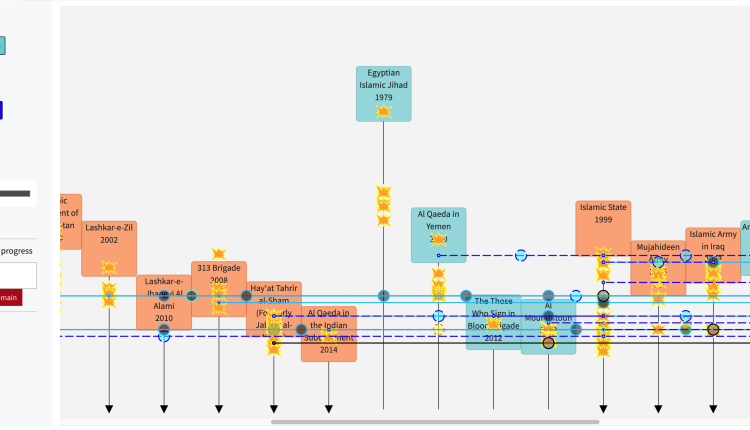
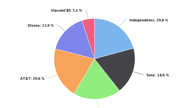
Through data visualization and careful database structuring, we were able to highlight robust historical data and bring their work up to date with the streaming realities of 2021.
The SLC website offers a wide variety of services, resources that are accessible for all users, and a creative and interesting aesthetic.
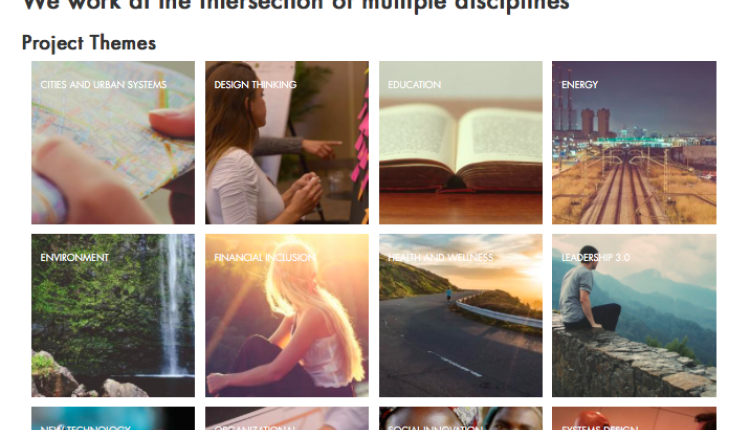
When a group changes the model of their organization, it's time to embark on a new information architecture to highlight the new focus of their organization: a site is only there to serve the mission, after all.
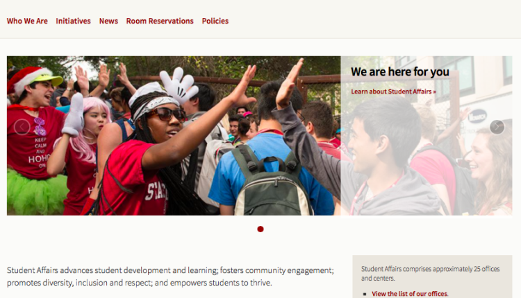
Fibonacci Web Studio has worked with Student Affairs at Stanford over the course of many years and many projects. This department has around ~30 websites, most of which are student-facing, all of which are built on Drupal.
Focusing on admin experience, we created an easy-to-update site to allow their team to showcase their research, with custom map functionality to show where that research was happening.
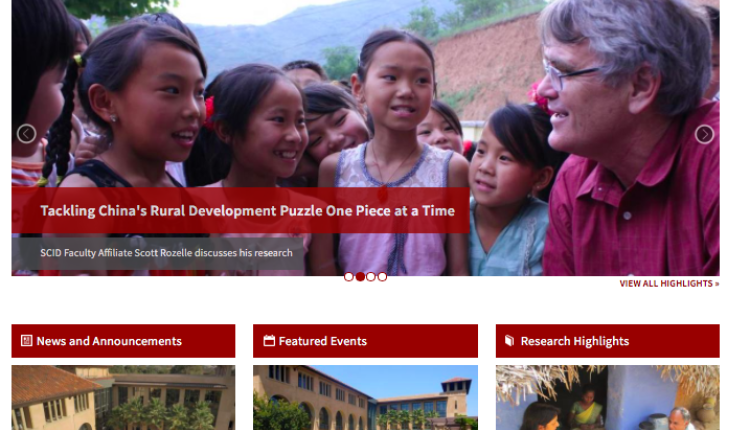
Supporting faculty websites is an exercise in empowerment: providing the best tools to the brightest minds, so that they can focus on their work.
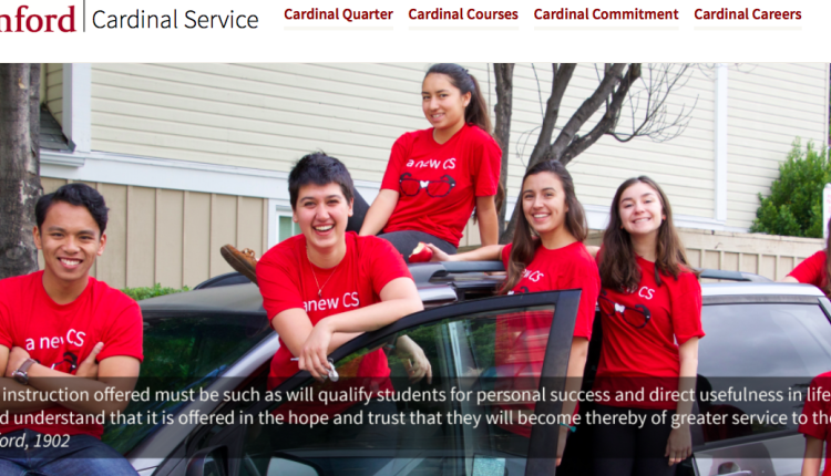
We utilized WordPress to create a hub that connected all the service-minded opportunities, events, and people at Stanford.
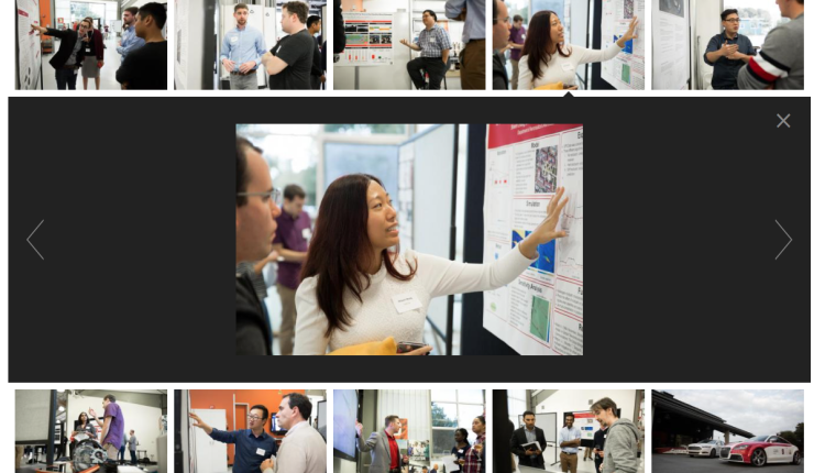
The Center for Automotive Research at Stanford (CARS) was creating a site using the standard sites.stanford.edu platform, but with a more advanced image gallery and data library to better showcase their work. We were ready to drive!
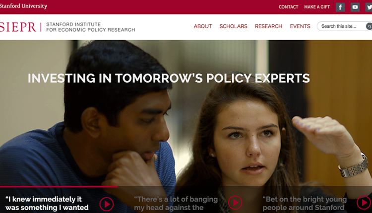
The SIEPR website was built as a tool to support their mission by providing information architecture and visual design that guides visitors to their destination with ease and pleasure.
It’s a web maxim we’ve all heard a thousand times: Content is king! This project proved to us how smoothly work can go when you all (client and developers alike) adhere to that maxim.
We created the architecture for a consistent, informational, and beautiful home base on the web that can be updated painlessly.
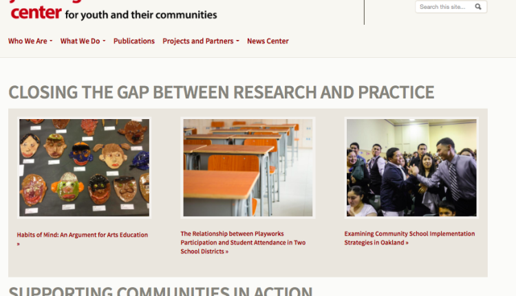
All research centers need good websites to share their findings—findings that otherwise might get buried in some library archive. This is a success story of one such site.
Migrating into Drupal 7 is no small task when you have one website, but with 33, oh boy!
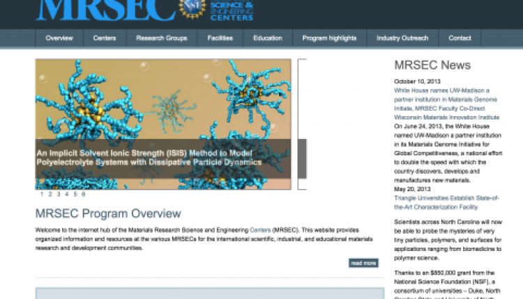
Long-running projects like MRSEC become a study in adaptation to changing times and changing needs while keeping what works. As we've updated the site to better available platforms in the last ten years, we've become experts in migration. This project aligns perfectly with our mission: using the handy parts of the internet to help researchers do research.
When thoughtfully designed and effectively built, the right information architecture can be life-changing.

