Wellness Network at Stanford for Office of Student Affairs
This is a story about information architecture, the part of web development that makes us hold onto our hats with excitement. When thoughtfully designed and effectively built, the right information architecture can be life-changing.
That's not an exaggeration. The Wellness Network site is a perfect example, designed to enable them to reach the people they need to reach with the information that needs to reach them.

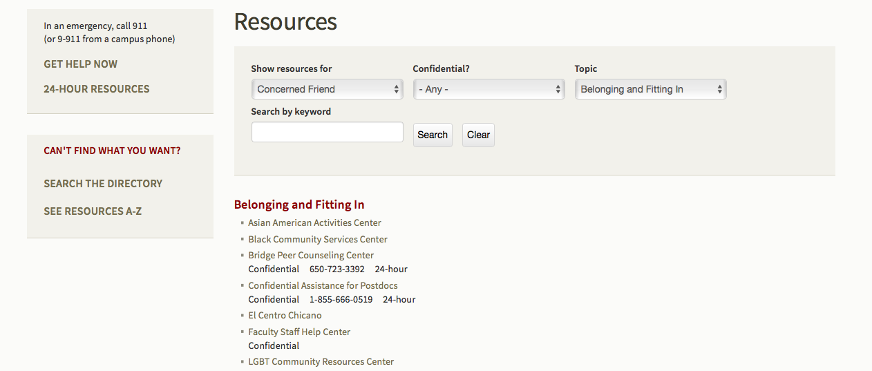
When the Wellness Network came to us, they had specific pages in mind for us to build: lists of resources for different audiences, separated by topic. We responded by enthusiastically informing them that we had a better idea.
Instead of lists, which are not easily searched or filtered, we proposed collections, culled from a master list of resources tagged with any topic or group that they pertained to. A campus coffee shop, for example, could be tagged to show up in searches for both parents and students; a mental health hotline could be tagged as confidential. A simple search tool with drop-down choices yields lists with links, phone numbers, and confidentiality information. It's simple, accurate, thorough, and accessible—information architecture that stands up.
