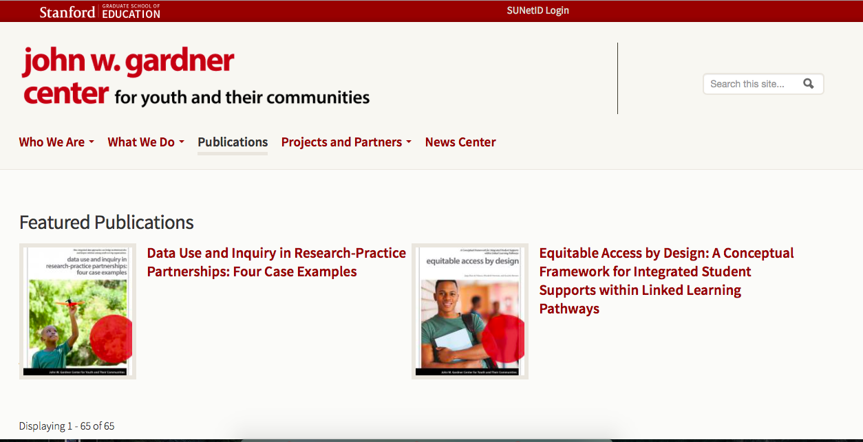
John W. Gardner Center for Youth and Their Communities
It’s a web maxim we’ve all heard a thousand times: Content is king! This project proved to us how smoothly work can go when you all (client and developers alike) adhere to that maxim.
Going in, the Gardner Center already had solid content prepared. This let us do all the development work with real content already in mind.

There were three key objectives in this project: they wanted a site that was Stanford branded, easy to edit, and consistent. Keeping in mind these objectives, we created content types and tested them with the actual content to finetune their features.
At the end of the day, we were able to deliver a product that met the actual content needs and didn’t have to use test content to show off the development work: we could deliver a real site that already functioned for end users.
